Showing posts with label school project. Show all posts

Saturday, May 21, 2011

Heavens - Fear

I did this illustration for my senior projects class. The whole class (made up of art historians, graphic designers, fine artists and illustrators) worked together to create a book filled with illustrations and text.

The overall theme of the book was the heavens, and my topic for the book was fear. My illustration depicts a girl that is about to receive a halo, but then she gets punk'd and the halo gets shattered and the monster says "sike, you gonna go to hellllll!" ...in other words, my illustration was basically about the fear of not knowing whether you'll get into heaven or not. I'm not a religious person... I just wanted to draw a monster but had to settle with drawing monster hands for the assignment.


I'm really stoked at how the image came out, though! It was the first time I've had a high quality/decent quality printout of one of my illustrations. I'm also proud of the illustration in itself; I learned a lot from it.

Thursday, May 5, 2011

The Prowl

Here's another project I did for my composition class. I got a bunch of new acrylic paints from a good ol' pal, so I was looking forward to using them for this project. I was out of masonite, so I recycled an older test painting and used it as my surface. Really like how the colors turned out.


Friday, April 29, 2011

Plague Doctor

I did this for my illustration class. Took awhile for me to finish it, but I finally got it done! It was designed to be a 9x24, 5 color screen printed poster, but I've decided to focus on printing another project and hold off printing this for another time.


The project theme was called beautiful/ugly and the class had to illustrate the beauty in something ugly. I chose to illustrate the bubonic plague. The beautiful aspect I found in the plague was the elaborate costuming of the plague doctors and their way of combating the plague through the use of herbs to cover up the deathly smell wafting from the infected. It kind of reminded me of a wizard or alchemist mixing up a powerful elixir using various ingredients, and although utterly futile in curing victims of the plague, I found the use of herbs in order to cure a disease to be a beautiful act due to its mysticism.

Wednesday, March 30, 2011

The Wolf


Here's another piece I did for my composition class. I'm still sticking with my central concept of the story of little red riding hood set in the future, but I'm slowly starting to stray away from the original structure of the story and giving it my own spin. The title of this post is extremely misleading as there is no wolf in the painting, only a mass of cloth and flesh. I decided stretch the story a little bit and portray the wolf as a shape shifting creature. I thought it fit nicely since the wolf was a devious character in the original story. Plus, I just wanted to draw a monster. I've actually been drawing a lot of weird creatures in my sketchbook as of late. Lots of skinny legs and whatnot. Fun stuff.

and here's an early sketch:


Tuesday, March 1, 2011

Little Red Riding Hood... IN THE FUTURE!

Here's a project I did for my composition class. The compositional theme we were focusing on was diagonal themed compositions.


The concept behind my piece was, if the title didn't give it away already, Little Red Riding Hood in the future. The ongoing concept for my pieces in this class is the story of Little Red Riding Hood set to take place in a futuristic setting. It was painted using acrylic on masonite. I had the urge to scan it up and finish the piece digitally, but fought the temptation and worked traditionally through the entire piece.

Thursday, February 24, 2011

Poster in the works Pt3/Painter's Guild Exhibit

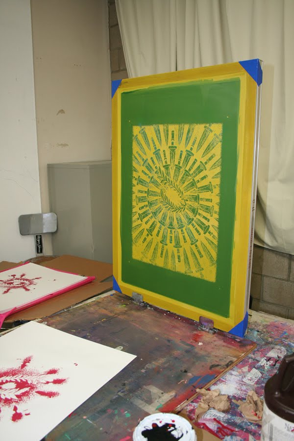
I finished the poster I was printing and was able to submit it into my school's Painter's Guild Exhibit. I'm glad that I was able to display my piece in the exhibit, even though it wasn't a painting (speaking of which, there was actually a good amount of photography and screen prints displayed in the show).


The concept of my piece is the assassination of Julius Caesar. There are 60 daggers in the composition representing the 60 approximate individuals that participated in his assassination, while 23 of said daggers are coated in blood to represent the number of times Caesar was stabbed.


I also submitted one of my digital paintings to the exhibit (It's the one on the bottom. The top piece belongs to my friend, sarahe)!

Monday, February 21, 2011

Poster in the works Pt2

First color laid down for my poster:


Monday, February 14, 2011

Poster in the works!

First project of the semester for my illustration class! These are photos of a black/white xerox copy I oiled up and prepared to shoot onto a screen. The actual design was done digitally. More info on the design later.


Monday, December 20, 2010

The Ambush


Here's my final assignment for my composition class. I was planning on doing the whole thing in acrylic, but sick days and time constraints forced me to finish digitally. The composition theme for this assignment was subjective movement through the use of gestures (things pointing one way, eyes looking another way, etc.). For the concept, I decided to have a robot wondering through a rain forest and being ambushed by a monster with molten claws. The whole piece felt rushed, even after going back into the piece to push it a little more.

Sunday, December 12, 2010

The Discovery


Another composition assignment. I decided to continue experimenting with an acrylic under painting plus digital. The composition theme for this assignment was space movement through the use of archways, windows, pathways, clutter, and empty space. I decided to illustrate the scrap metal robot, the robot I drew in my earlier assignment, discovering a strange rain forest.

Wednesday, December 1, 2010

Hybridization


This piece was done for my illustration class. The image was first created digitally, then outputted as a screen printed poster, which is three colors. I've known about the screen printing process for awhile now, but this was my first time going through the whole process and doing it with my own hands. You really do learn to appreciate the quality and craftsmanship of screen printed posters made by big name artists after trying to do it yourself. There was a lot of trial and error and a lot of messed up prints. I decided to make a small run of 12 to test the waters, but only 6 prints came out looking decent. It was a good learning experience overall, and I plan on printing some more of my stuff in the future.

Friday, November 5, 2010

The Everlasting Journey


Another assignment for my composition class, this time focusing on a serpentine composition. The serpentine elements are there, but I feel that they're pretty weak. The concept behind the piece was a group of nomadic robots roaming the desert in a sandstorm. The first image was done entirely in acrylic, while the bottom image was a digitally enhanced version. I could have pushed the acrylic painting a lot more, but time constraints forced me to scan my painting and finish it via photoshop. I like it though, and will experiment with this traditional underpainting/digital touch-up process in future.

Friday, October 22, 2010

Splintering Bird (Cycles)

Done for my illustration class. Something to do with life, death, and the soul and physical "shell" returning to nature.

Friday, October 8, 2010

The Scrap Metal Golem


This was done for my composition class. We had to choose an overall theme for all of our projects in this class, so I chose robots. The concept behind this robot is a small, spherical robot that manipulates scrap metal to form a body.

Some backstory (since my instructor wanted some sort of narrative to go along with my chosen theme): The actual robotic components of the golem are the little, metal spheres located at the center and at the joints of the golem. A single orb-shaped drone is able to form a clumsy, yet mobile, metal body while a body controlled by more than one drone can be highly complex and agile. Through the use of magnetism and coordinated teamwork, the drones are able to control their metal shells as if it encased a single entity. The drones are employed by a mysterious factory, which sends out the drones to retrieve valuable scrap metal and bring it back. The drones search for the metal, create a body out of the found metal, and walk back to the factory to deposit their findings and repeat the process. Several variations of the scrap metal golem exists and it is postulated that each drone has its own unique personality, which in turn affects the look and feel of its newly created body.

Sunday, September 19, 2010

Endangered Cranes


Here's my first project for my composition class. We had to pick out a magazine article and illustrate the article using horizontal and vertical themes. I picked an article about endangered cranes wintering in the Korean DMZ. I tried putting a lot of strong horizontal and vertical elements into my piece, but they weren't noticeable enough to fit the assignment. My instructor was willing to overlook the fact though because the piece I made was so awesome. yay.

and yes, my eyes were hurting from drawing so much grass.

Wednesday, June 2, 2010

Stuff I completely forgot to post.

Here are some assignments I did for my illustration class last semester (the semester that just ended). I was meaning to post these right after completing them, but whoop dee doo I forgot.

Assignment: Using only reference sketches and memory, complete a drawing that demonstrates the moods and/or feelings of a particular place or area.


I took the easy way out and drew my room. Not only was it an easy location to visit ( sarcasm, I'm always in my room), I practically know my room inside and out, making the need for reference sketches almost obsolete. I wanted to convey a warm and cozy feeling, but I don't think that worked out too well. I wanted the finished piece to have a sketchbook feel to it, so I drew out all my lines and then scanned the drawing up so I could thicken some of the lines in photoshop. I'm fond of using minty green colors, so that's why I decided to color my walls in said color. Next!

Assignment: Pick an editorial article and create an illustration for it; Narrative illustration project. (Somewhat bummed out that we weren't going to actually illustrate a story. I was looking forward to drawing knights and dragons).

The article I chose to illustrate was about stem cell research. The finished illustration was pretty straight forward; A stream of stem cells flowing from a petri dish, changing into nerve cells. It didn't really illustrate the article specifically and could have been used for any article about anything relating to stem cells. I had a different concept that had a scientist surfing on a stem cell with student interns surfing behind him while he led the way, which would have worked with the article better since the article was about students interning with real researchers, but I scrapped the idea because it wasn't serious enough for the publication.

Looking back at all my assignments from my illustration classes, I can conclude that my style was all over the place and I didn't do too well when it came to picking a style and sticking with it. I can tell, though, that the stem cell illustration shares similarities with my past illustration of an unraveling brain, meaning that I was starting to settle down with some sort of style.

Thursday, May 13, 2010

Sing Everyday

Assignment: Illustrate a fortune from a fortune cookie.


For the assignment, each student was given a fortune cookie and had to illustrate the fortune that was inside their cookie. My fortune read "Sing everyday and chase the mean blues away."

I had a couple different concepts I wanted to work with. One involved a person crouching in a circle of light while being surrounded by shadow creatures that were being torn to bits because of the light. I decided to go with the concept with a bird chasing the "mean blues" away.

I got the original idea from staying up all night late enough to watch the sun rise on a number of occasions. I noticed that birds would always sing when dawn was just around the corner, so I came up with the idea that the birds sing in order to chase away the darkness, or the "mean blues." Instead of having the sun rising in the background behind the birds, I decided to have the birds be portrayed as the actual light of dawn.

The "mean blues" were depicted as darkness. From the beginning, I knew I wanted to portray the "mean blues" as shadowy monsters, so I threw in some hands and drew skulls and faces in the fog surrounding the shadows. I added in the stars to drive the point home that the shadowy monsters are the embodiment of the night that is being chased away by the coming dawn.

I was going for a fantasy type illustration, and I'm glad that it read that way when my instructor was critiquing it. I got excited when he said that it had a Dungeons & Dragons-esque fantasy feel to it because that's exactly the type of work I want to get into, and hearing that meant that I was traveling in the right direction.

Friday, April 23, 2010

Panoramic


Assignment: Illustrate a map.

This was a very open ended assignment. I chose to map out my entire Monday/Wednesday, which are the days where I spend most of the day at school. My original concept started with me waking up and ended with me going to bed. This concept was obviously too ambitious, so I had to trim the concept down in order for me to complete the project on time. I decided to cut my concept in half and only mapped out from the time I woke up to the time I got home from school. My illustration would have been at least twice the length it is now have I stuck with my original concept! I had to shrink the canvas size to six inches tall in order to keep the file size small, but the illustration would still be around 7 feet long if I decided to print it out. Luckily I didn't have to print it out for my presentation... that would have been expensive, especially for something that might need revisions.

Sunday, April 18, 2010

...and our minds will fail us


Assignment: Choose two subjects from the lists of available subjects. Create an illustration portraying your two chosen subjects. There were two lists of subjects, and I was only allowed to pick one subject per list.

I chose mental illness as one of my subjects and human anatomy as my other. I discovered an interesting way of approaching the assignment; I noticed that one list of subjects could act as a list of editorial article themes and that the other list could act as the subject matter of the illustration used for the editorial article. For instance, mental illness would be the theme of the editorial article and human anatomy would be the subject matter for the illustration I would create for the article.

The conceptualizing for this piece was rather easy. I knew exactly what I wanted to draw, so I was able to get this finished rather quickly. The concept came to me so easily that I started to worry if I've seen it done somewhere before and forgot about it. Various google searches came up with nothing, so I went along with my original concept. Colors for the top of the piece took awhile. I tried using blue at first, but the tatters started looking too much like water. Red was one of my first choices, but it was too chaotic. I went with a pale/drab purple because it reminded me a lot of necrosis, thus working well with the overall theme of mental illness and decay.

EDIT:


Made some revisions after my critique. The withering/shredding brain strand was a little too orderly, so I added more strands floating off in various directions.

Tuesday, April 13, 2010

Personals Ad


Assignment: Find a personals ad and illustrate the person who created the ad.

I found an average personals ad about a girl plagued with short-lived relationships. She describes her situation and goes on to making a list of things she wants in a relationship. The things were pretty simple: wanting to hold hands, being surprised with hugs, kisses, and gifts, etc. The whole ad was pretty... average, so instead of making a boring illustration of a girl crying in the corner, I portrayed the girl as being extremely needy and turned her into a black hole; I wanted to over exaggerate the whole ad. It was fun.