

Showing posts with label ink. Show all posts
Showing posts with label ink. Show all posts
Monday, January 30, 2012

Sunday, January 1, 2012
Happy New Year!

Tuesday, August 31, 2010
Sky and Trees
An ink painting I made for a family friend.


...and a digitally modified version of the same painting.

Thursday, May 6, 2010
The Struggle


I haven't used traditional mediums in a looooong time. This was a nice break from working digitally.
Saturday, September 26, 2009
Art Class Stuff
For my first project in my Illustration Media and Techniques class, I had pick a topic and create 4 drawings using ink and a variety of techniques listed for each of the drawings. I randomly chose chameleons for my topic.
 ^Tonal drawing using crosshatching and stippling
 ^Graphic use of line
 ^Expressive use of line
 ^Scratchboard
P.S: I've updated the black version of the Witching Hour design. I spent a lot of time making it work because I wanted to have two working colorways for the design. It garnered a good amount of votes and support, so hopefully it'll get printed in the near future.

 ^Tonal drawing using crosshatching and stippling
 ^Graphic use of line
 ^Expressive use of line
 ^Scratchboard
P.S: I've updated the black version of the Witching Hour design. I spent a lot of time making it work because I wanted to have two working colorways for the design. It garnered a good amount of votes and support, so hopefully it'll get printed in the near future.

Tuesday, September 15, 2009
Witching Hour
More trees!!!!
 I've been wanting do a much larger piece based off the last piece I posted. This piece is 11''x25'' tall, and it looks pretty cool up on my wall. I started this piece just for the sake of doing art, but I didn't really have anything to lose so I mocked it up on a shirt and entered it in Design By Humans' Halloweek 3 contest: http://www.designbyhumans.com/vote/detail/62929

 I've been wanting do a much larger piece based off the last piece I posted. This piece is 11''x25'' tall, and it looks pretty cool up on my wall. I started this piece just for the sake of doing art, but I didn't really have anything to lose so I mocked it up on a shirt and entered it in Design By Humans' Halloweek 3 contest: http://www.designbyhumans.com/vote/detail/62929
Saturday, September 5, 2009
The Tree Line
I'm starting to realize that I make something cool every time I do a warm-up painting or drawing. I had another drawing I was going to work on and initially started this as a test page to try out the new ink I bought. It ended up looking cool, so I set my other drawing aside to focus on this one. The purple branches were done using brown ink, but the ink turned purple when I added subsequent washes over them. I used masking fluid for the stars. They came out a little bigger than planned, though. The wet on wet technique was perfect for making the clouds, and that's the main thing I'm proud about in this painting.


Wednesday, August 26, 2009
Zach Johnsen study
My classes started this week, so you'll be seeing a lot more school projects and a little less design work *sad face* I do however have one or two completed designs, but I'm gonna keep them hidden for a little while ;)
The only hands-on art class I have this semester is Illustration Materials and Techniques. A lot of instruction on traditional mediums such as pen and ink, acrylic paint, and oil paint. For a homework assignment, we had to pick an ink drawing from one of our favorite artists and re-create it using the same mediums the artist used, in this case ink and ink pens. I chose to re-create a piece by Zach Johnsen.
 I didn't bother scanning it, so perspective of the photo throws out the proportions, but other than that the drawing is pretty dead on proportion-wise. It came out better than I expected, but I need a lot of improvement when it comes to crosshatching and taking my time.
The only hands-on art class I have this semester is Illustration Materials and Techniques. A lot of instruction on traditional mediums such as pen and ink, acrylic paint, and oil paint. For a homework assignment, we had to pick an ink drawing from one of our favorite artists and re-create it using the same mediums the artist used, in this case ink and ink pens. I chose to re-create a piece by Zach Johnsen.
 I didn't bother scanning it, so perspective of the photo throws out the proportions, but other than that the drawing is pretty dead on proportion-wise. It came out better than I expected, but I need a lot of improvement when it comes to crosshatching and taking my time.
Wednesday, July 8, 2009
update #21 (flutter)
I've entered Design By Humans' 10K contest! You can view my entry here: http://www.designbyhumans.com/vote/detail/58663


This design took me awhile to complete. I was just finishing the pencil sketch phase when the contest was announced, but the announcing of the contest was enough to give me the boost of adrenaline I needed to work on and finish the design in a timely manner. This piece may look bland compared to my other works. I kept it simple (one color is as simple as it gets) so that it would be able to easily be printed as an allover print.

On another note, I've recently ordered a large, Wacom Intuos 4. I am also in the process of upgrading to a much faster computer. Very costly, but It will pay for itself in time.


This design took me awhile to complete. I was just finishing the pencil sketch phase when the contest was announced, but the announcing of the contest was enough to give me the boost of adrenaline I needed to work on and finish the design in a timely manner. This piece may look bland compared to my other works. I kept it simple (one color is as simple as it gets) so that it would be able to easily be printed as an allover print.

On another note, I've recently ordered a large, Wacom Intuos 4. I am also in the process of upgrading to a much faster computer. Very costly, but It will pay for itself in time.
Monday, June 29, 2009
update #20 (sneaky peeky)
Low quality photo. Didn't want to try scanning a18x24 drawing with a 9x12 scanner when I barely just started the design :p


Monday, June 22, 2009
Happy Father's Day!


 I've never worked so quickly yet so intricately in such a short amount of time. Started this piece at 4-5am and worked for 1-2 hours, slept, celebrated father's day with the family, then worked a couple more hours around 8pm. Something like this would usually take me a week to complete. I was surprised that I did it in less than a day, and had the time to give it to my dad. Happy father's day! Wouldn't this make a pretty neat Teefury shirt? With the thunder bolt in the eyes and all? haha
I focused a lot on detail and precision for this piece. I've noticed that a lot of my work has been half-assed in some areas, usually because I rush to see the final product and cut corners... not good, especially since this yields in low quality work. I told myself to slow down and take a breath after each line and make sure I knew what I was going to do before the quill touched the paper.
Also, I went out and bought a couple frames and FINALLY framed my dad's birthday gift. I actually presented this to my dad and said it was his father's day gift, but then reminded him that it was his birthday present and that the frame was the actual gift.

 SUMMON THE FLEET!!!
Thursday, May 14, 2009
update #13 (Mother's Day)
Some Mother's Day cards! First one was for my mom, and the second was for my grandma.

It's surprising to see how an art piece turns out when you're pressed for time and have little to no idea of what you're going to draw.


It's surprising to see how an art piece turns out when you're pressed for time and have little to no idea of what you're going to draw.
Saturday, April 25, 2009
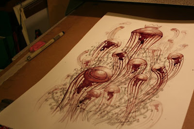
update #11 (sneaky peeky)
Always wanted to do this, but decided to make it top priority on my designs-to-do list because of popular demand.

Monday, April 13, 2009
update #8 (take flight)
So here's the finished design I've been working on!

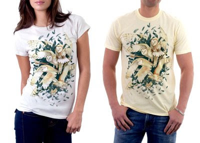
I find it hard to call it finished because it doesn't really look finished in my eyes. I can probably push the design some more, for example: adding more detail to the feathers so there's something more than just watercolor/ink washes, or just adding more linework in general. Also, some of the owl poses seem very unnatural, as if the owls posed in that position just for the sake of the design. I'm most likely going to redraw the entire design and make at least a couple of the owls look like they're just randomly flying around and not just posing, maybe even have one owl experiencing some turbulence while flying with the group; something to make the design more realistic. I'm also feeling that the design is lacking epic-ness, for lack of a better term. Also, it would be nice if I actually drew a feather to replace each and every brushstroke I used for the background of the design.


I find it hard to call it finished because it doesn't really look finished in my eyes. I can probably push the design some more, for example: adding more detail to the feathers so there's something more than just watercolor/ink washes, or just adding more linework in general. Also, some of the owl poses seem very unnatural, as if the owls posed in that position just for the sake of the design. I'm most likely going to redraw the entire design and make at least a couple of the owls look like they're just randomly flying around and not just posing, maybe even have one owl experiencing some turbulence while flying with the group; something to make the design more realistic. I'm also feeling that the design is lacking epic-ness, for lack of a better term. Also, it would be nice if I actually drew a feather to replace each and every brushstroke I used for the background of the design.
Saturday, April 11, 2009

Sunday, April 5, 2009
update #6 (warm up)
I wanted to start on some new designs today, but was afraid to jump straight into a design without warming up on my ink and brush skills. My warm up took a little longer than expected and I ended up drawing something neat.
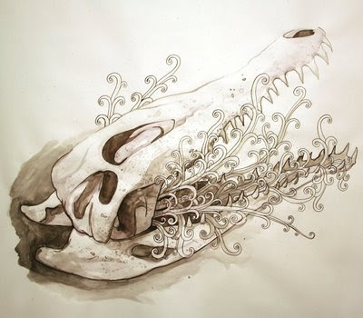
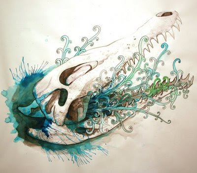
I apologize for the low quality images that I took with my camera. I wish I had a big scanner for larger works like this... but that would cost moolah and space. At least I don't have to worry about jumping into my designs tomorrow.


I apologize for the low quality images that I took with my camera. I wish I had a big scanner for larger works like this... but that would cost moolah and space. At least I don't have to worry about jumping into my designs tomorrow.
Friday, March 20, 2009
don't leave me, dear

I made this for my grandma :p
I got really frustrated near the end when I was thickening some lines with a fountain pen. For reasons unknown the pen would barf up huge amounts of ink, leaving an uneven line. It was fun though and I enjoyed getting an art piece done. I feel that my color scheme choices are getting better. I have no idea what to name this piece. I might just go with the title of this post.

teh details. I always like drawing my horns with a wood grain. That's just how I do it.
 It looks pretty sweet on a shirt, but I don't want it to seem like I copied Godmachine's shirt: http://emptees.com/tees/11046-architects
Some major alterations will be done if I ever decide to mock this up.
Friday, February 27, 2009
hello
hey everybody!
Just to let everyone know, this blog won't be 100% dedicated to art; Every once in awhile I'll post about something interesting I've found, such as this article I read a couple days ago: http://www.inhabitat.com/2006/04/07/prefab-fridays-prefab-for-hermit-crabs/
and here's a school project I completed a week ago:


 The assignment was to pick an intrinsically small object and create a scaled up model of the object with wire. After the wire sculpture was made, we had to use paper mache to create an illusion of a solid form denigrating into nothing. I chose a hex nut as my object. It was a very painstaking process getting the shape right. the wire sculpture itself, without the paper mache, was very accurate and actually looked like a hex nut. however, when I added more wire to make a base for the paper mache, the shape was lost and most of the straight edges got rounded off. I'm really proud of the interior threading of the hex nut. That area took me the longest to construct and to paper mache, and I think the time that went into it really shows.
I've been working on another tee design for some random design contest. Here's a teaser :p

Just to let everyone know, this blog won't be 100% dedicated to art; Every once in awhile I'll post about something interesting I've found, such as this article I read a couple days ago: http://www.inhabitat.com/2006/04/07/prefab-fridays-prefab-for-hermit-crabs/
and here's a school project I completed a week ago:


 The assignment was to pick an intrinsically small object and create a scaled up model of the object with wire. After the wire sculpture was made, we had to use paper mache to create an illusion of a solid form denigrating into nothing. I chose a hex nut as my object. It was a very painstaking process getting the shape right. the wire sculpture itself, without the paper mache, was very accurate and actually looked like a hex nut. however, when I added more wire to make a base for the paper mache, the shape was lost and most of the straight edges got rounded off. I'm really proud of the interior threading of the hex nut. That area took me the longest to construct and to paper mache, and I think the time that went into it really shows.
I've been working on another tee design for some random design contest. Here's a teaser :p

Subscribe to:
Posts (Atom)

 Posts
Posts


